

Cover design. Kabam, we are jumping in…here we go. I’m pumped about this because I’m a visual person and I am drawn to good covers. Go on – admit it, you are too. Last week we covered 5 basics to good design and this week, we’re putting them to use!
• Balance and hierarchy
• The Golden Rectangle
• Fonts
• Images
• Color
These are your major players to building your cover super team. If you are knowledgable in design programs like Adobe InDesign, Illustrator or Photoshop, you have a leg up. If not, you may want to leave your cover up to a professional.
I went through 6 different version of my cover for The Dove: Book One of the Legend. The first ones I thought I liked, but then I sat back and really looked at them and then I didn’t like them at all. I don’t recommend settling for the first thing you dream up. Your cover is important. It needs to visually represent your book – that is HUGE. It needs to take into account your target audience.
Since I don’t want to use anyone else’s cover as an example of what not to do, I’m going to use mine. Let’s pick them apart based on our 5 elements of design (although for simplicity, we’ll combine balance and hierarchy with the golden rectangle; both concepts relate to layout).
Version 1

It’s interesting…but lets pick it apart based on our 5 elements of design:
- LAYOUT: Title is undersized. Names are insignificant looking. It’s torn between the woman’s face on the left and the title on the right.
- FONTS: Eh….. not a good reaction.
- IMAGES: Use of copyrighted images. BIG NO NO! This was just a mock-up for me, I never intended to use these images. My plan was to paint it.
- COLOR: I don’t recommend black and white. Throw a little color even an accented neutral.
Version 2
Also interesting but…
- LAYOUT: The balance of font vs. image are competing in weight.
- FONTS: Better. Too soft, though. I needed something with more strength.
- IMAGES: What does the image say about the book? If I had to guess I think…hmmm, nothing. It doesn’t lend itself to the mystery or any aspect of the story.
- COLOR: It’s blue – calm, serene, low energy. Also not what I wanted to portray.
… it’s forgettable.
Version 3
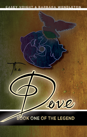
It is starting to represent the book more now.
- LAYOUT: Closer. The title is now the most significant element.
- FONTS: Still bothering me. I need something stronger.
- IMAGES: I have an interesting image of the pendant from the book, the Dove is coming out of it but SOMETHING IS OFF. The image doesn’t speak to me, it doesn’t make you think ‘hmmm, I want to know what happens in that book.’
- COLOR: It’s a little better. There’s more energy because the colors are warmer. And it’s “earthy”, which fits my Native American theme. But perhaps it’s too colorful with not enough contrast.
Back to the drawing board.
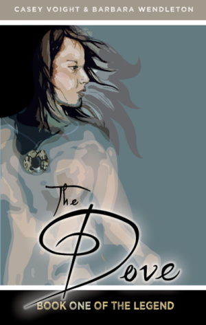
Version 4
- LAYOUT: The journey through the cover seems to make more sense now. You are drawn to the visual image first, then the title and finally the author. “Hm, that book looks interesting. Oh, it’s called The Dove – and it’s a series. Cool! I wonder who wrote it…”
- FONTS: Much better. I definitely want to know what happens here.
- IMAGES: This cover represents the book pretty good. You get a hint that it is a Native American themed story. You get a feel for pain and struggle and that hits the viewer on an emotional level.
- COLOR: The color is dark and the image pops – ALL GOOD.
BUT…now it looks like a romance novel – not what I’m going for 😦 It doesn’t represent everything that I need it to.
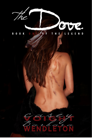
Version 5

We are getting there! It could be carried by a guy and he wouldn’t feel weird about it.
- LAYOUT: I’ve gone much simpler here, and I like it. It’s dramatic with lots of contrast.
- FONTS: Still like the fonts. I think I’m settled with those.
- IMAGES: This represents the story, it contains mystery to hit the viewer on an emotional level.
- COLOR: Bold and contrasting. Good.
BUT now it looks like a vampire novel. Those have been popular, but my story has a Native American setting and this looks too modern.
Version 6
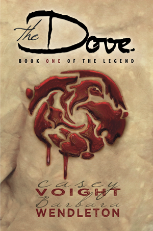
It finally feels right. AND I’m writing a series of five and now have an element that can be used to tie them all together.
- LAYOUT: Success! I like the simplicity and drama.
- FONTS: The fonts work well together. It isn’t too masculine or feminine.
- IMAGES: It represents the story visually. It hits on emotion with the blood drips; I want to know what happens. The rawhide says Native American without being too over the top.
- COLOR: Warm energizing colors that work well together.
What I learned from doing this is that even if you like your first, second or third versions, keep going. Change things up until you have 4-5 different options. You will gravitate towards one and know where to focus your time perfecting it.
Cheers and happy designing! Casey
